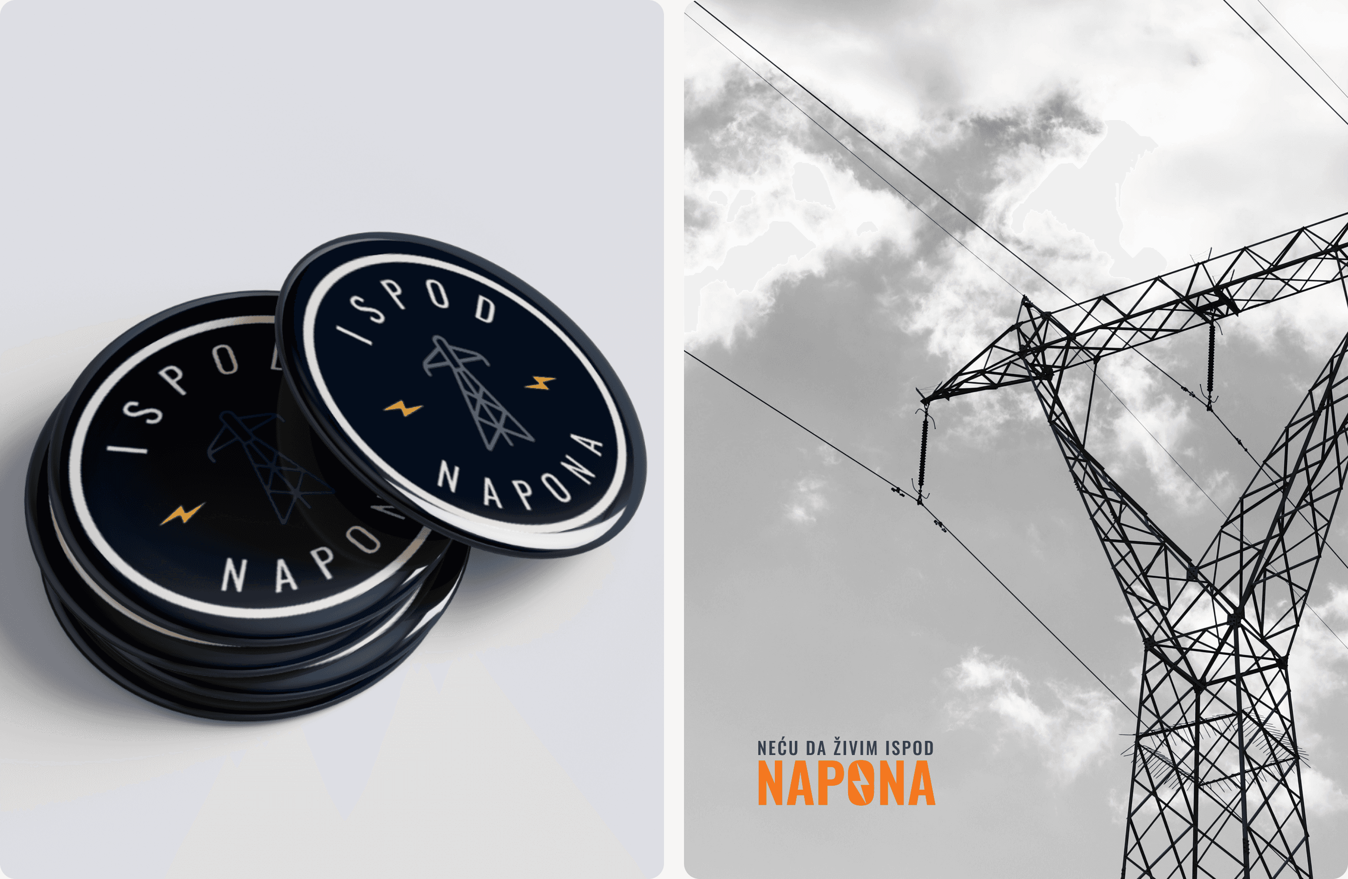
Under Voltage
An awareness project highlighting the impact of living near power lines and everyday environmental risks.
Product & Brand Design
Project Overview
Client: Under Voltage/Ispod Napona
Industry: Social Impact / Community
Timeline: 3 weeks (2025)
My Role: Brand Designer
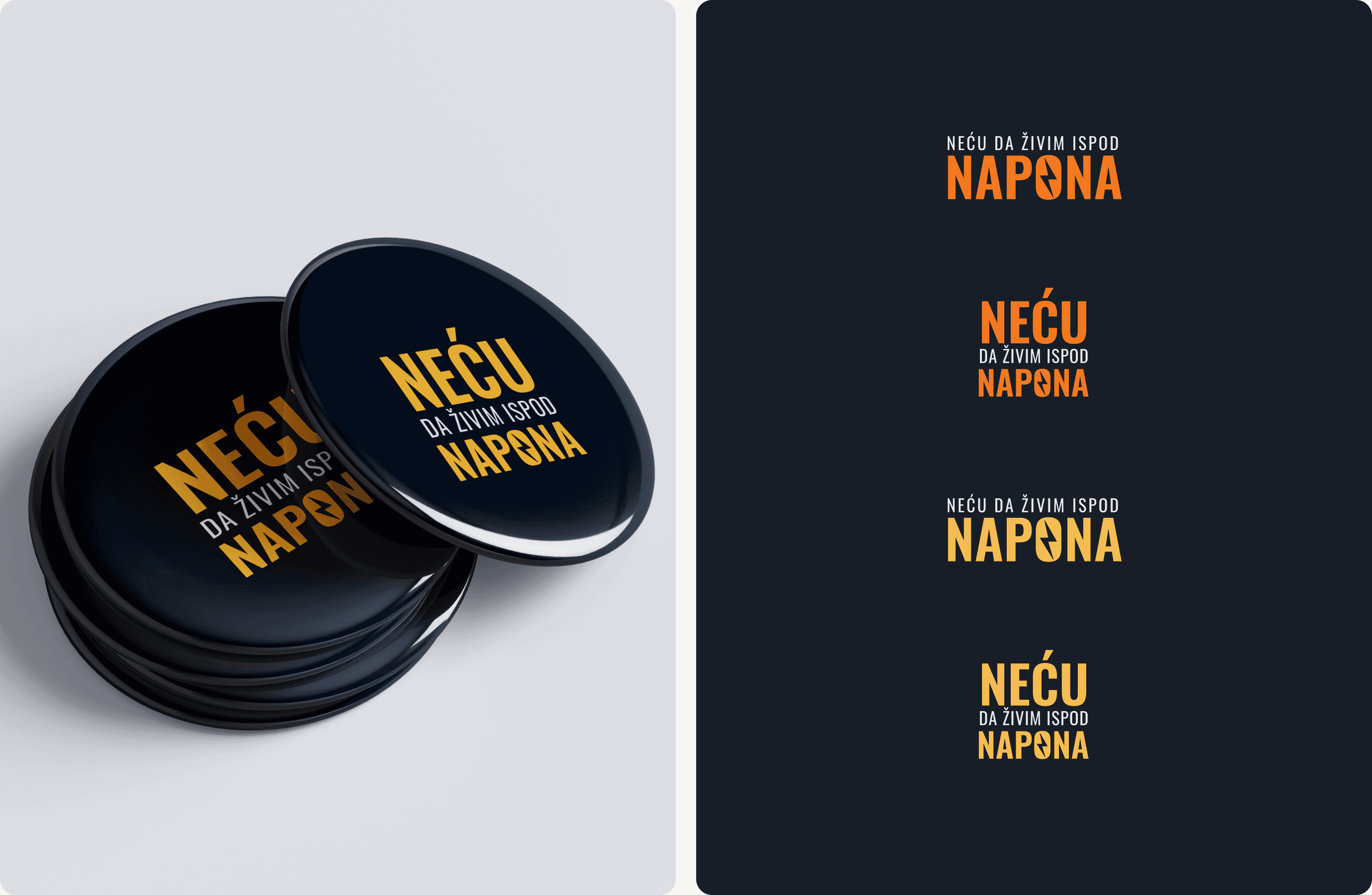
The visual identity and campaign materials were created to make complex information easier to understand and more approachable for a wider audience.
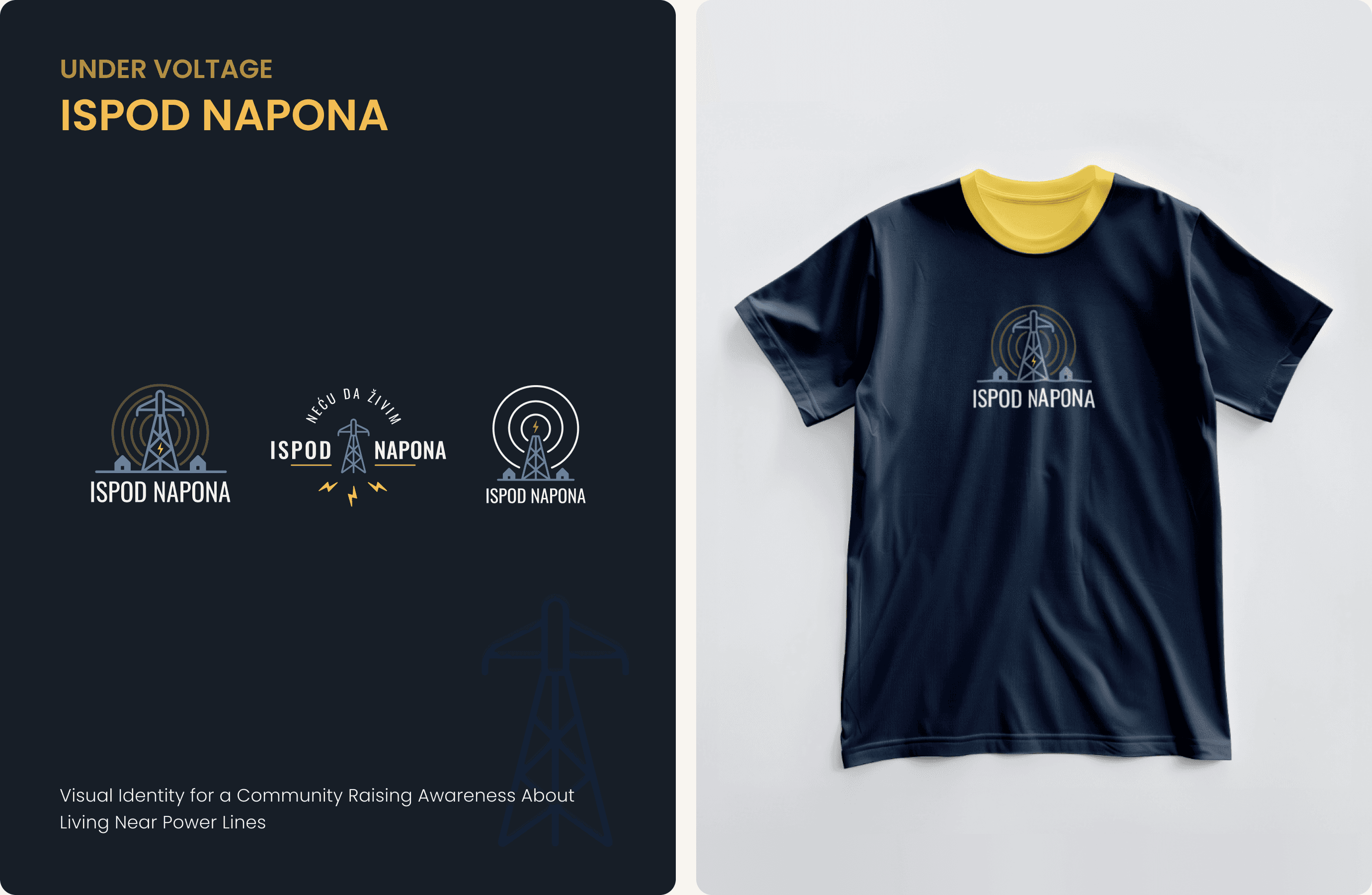
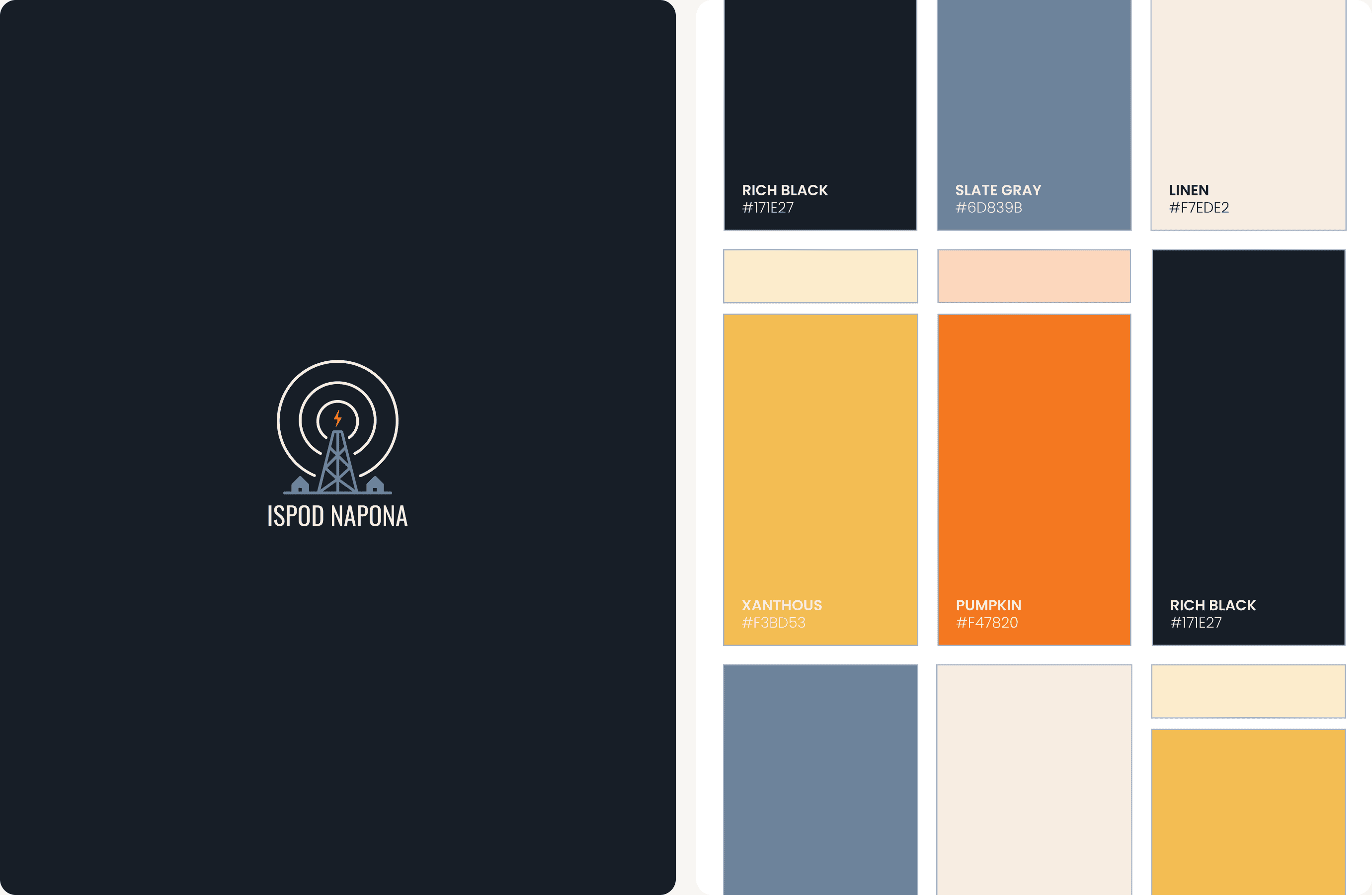
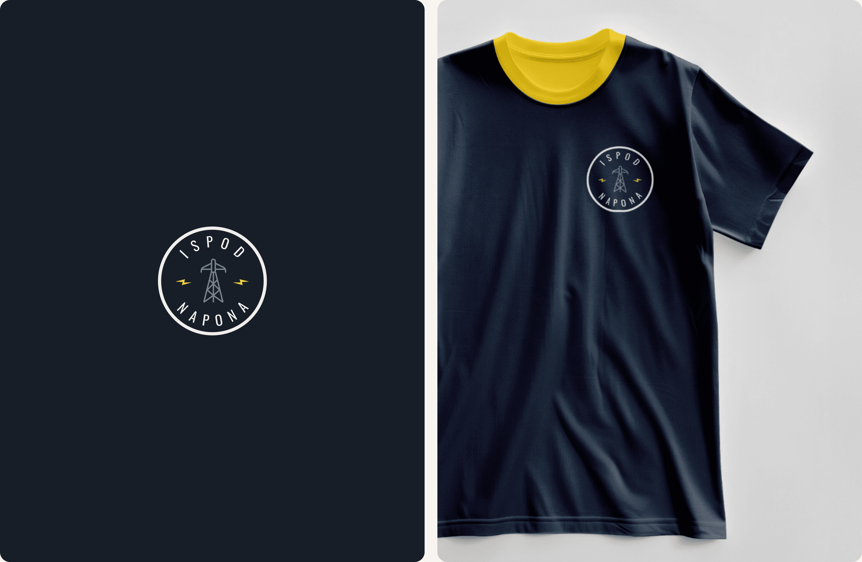
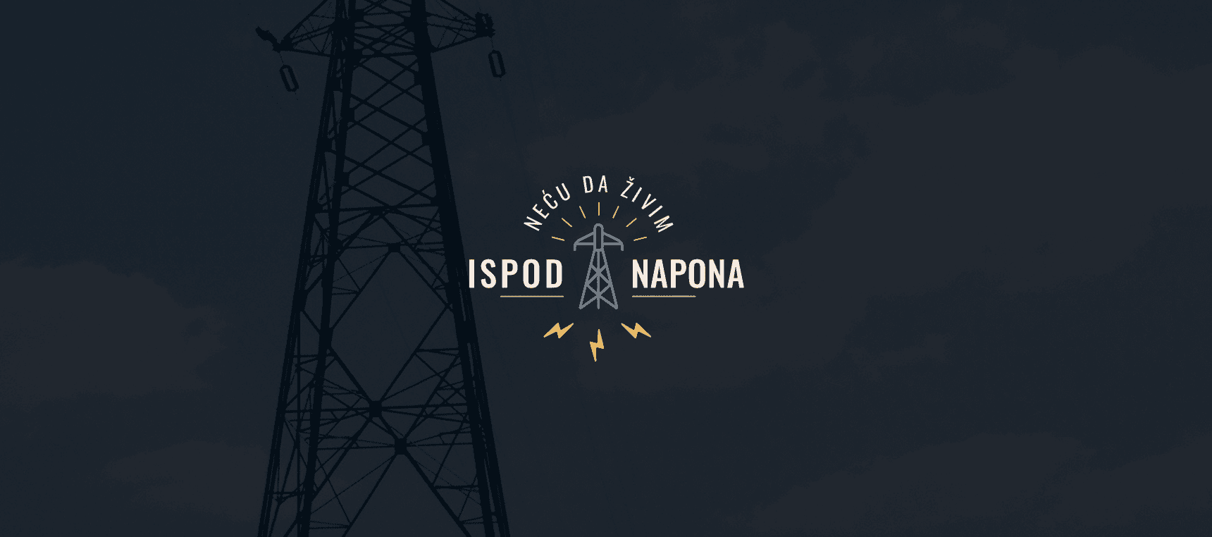
Bright yellow and orange tones were used to represent the invisible waves spreading from power lines toward nearby homes, helping translate an abstract and often unseen risk into a clear and recognizable visual language.
The logo system was designed in multiple variations, including symbol based, typographic, and combined versions, allowing the identity to adapt naturally across different formats and communication needs.
Check out live project here.
Design Solution